House of Goodness
Kaleidoscope of Flavour
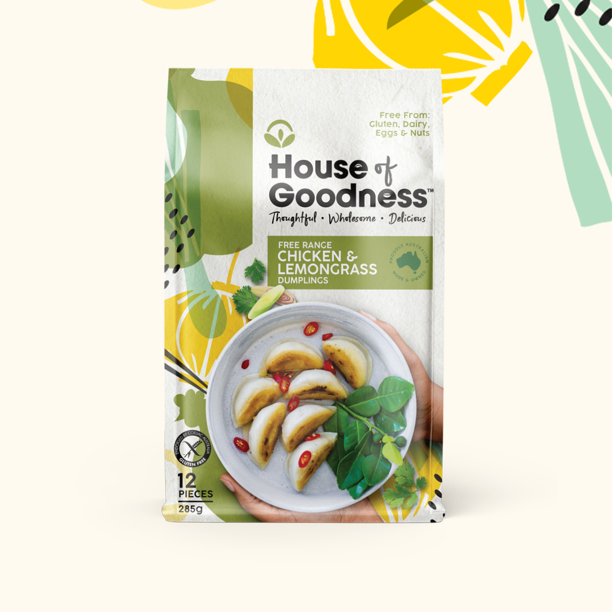
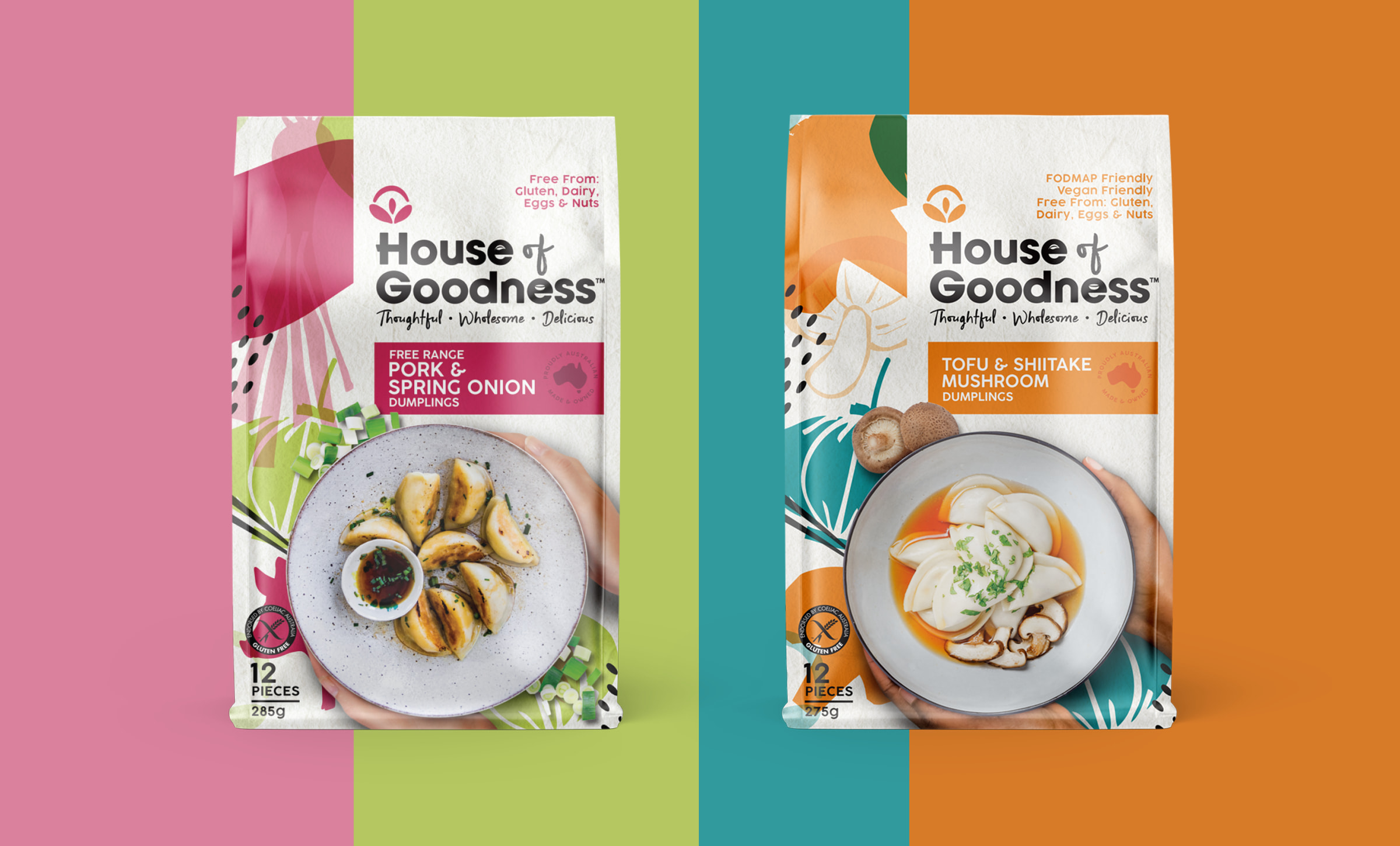
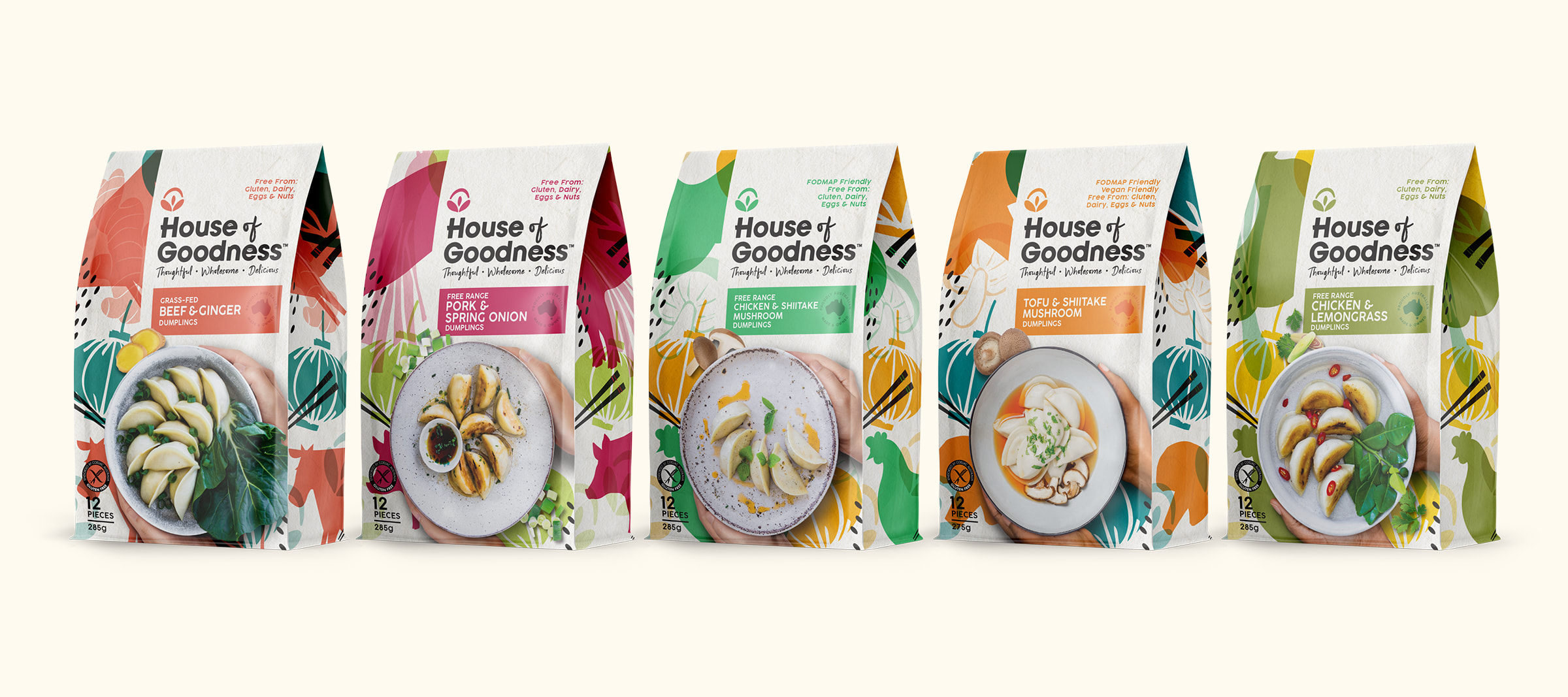
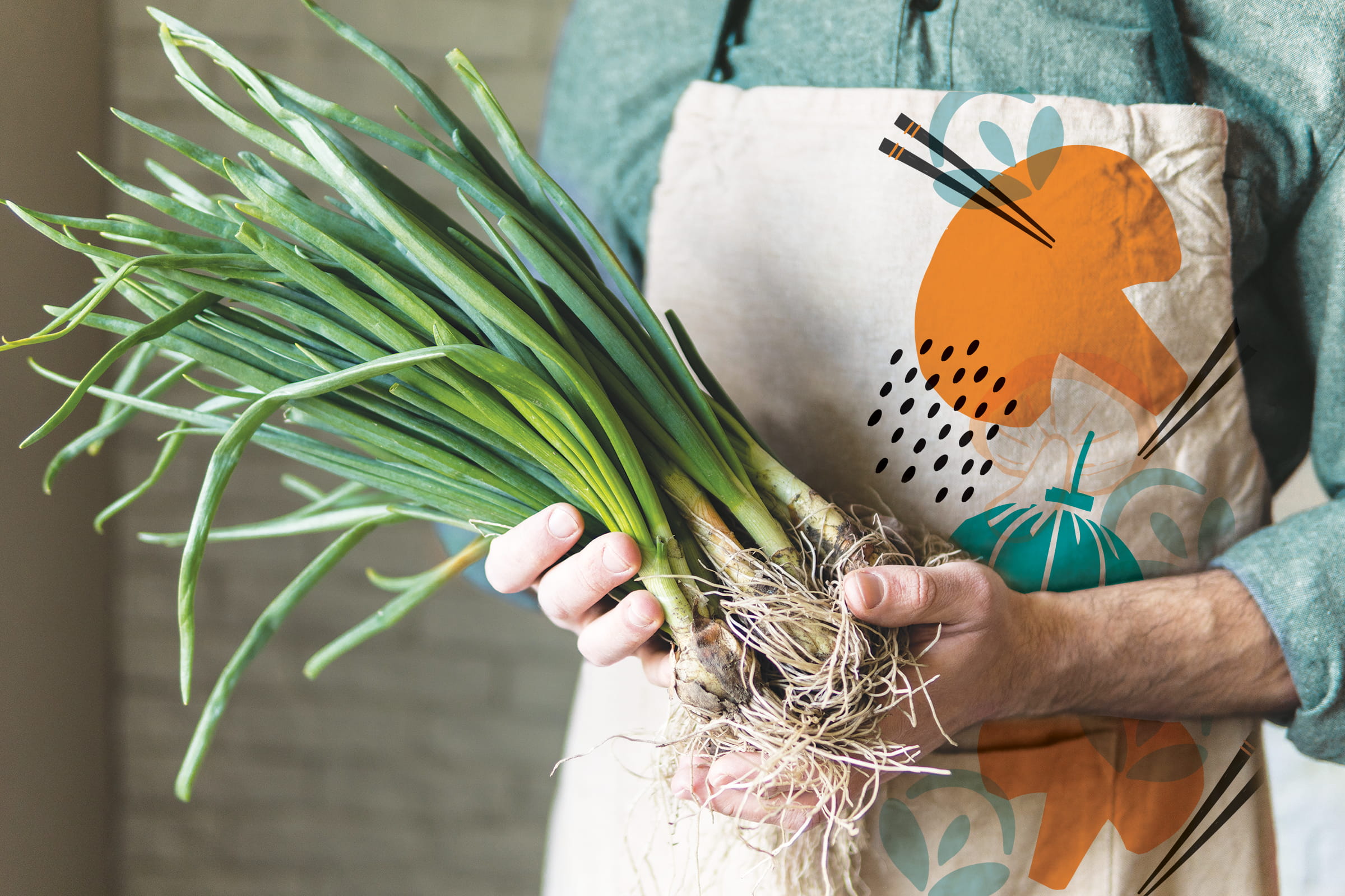
The vibrant colour palette is a visual cue to the taste-bud tantalising flavours of this delicious range. These products are free from gluten, dairy, eggs and nuts, but are bursting with flavour. The colours for each variant were inspired by the core flavour cues and balanced with a bright, contrasting colour to guarantee shelf stand out and modernity. A suite of stamp-style Illustrations was created as a background wallpaper for each variant.
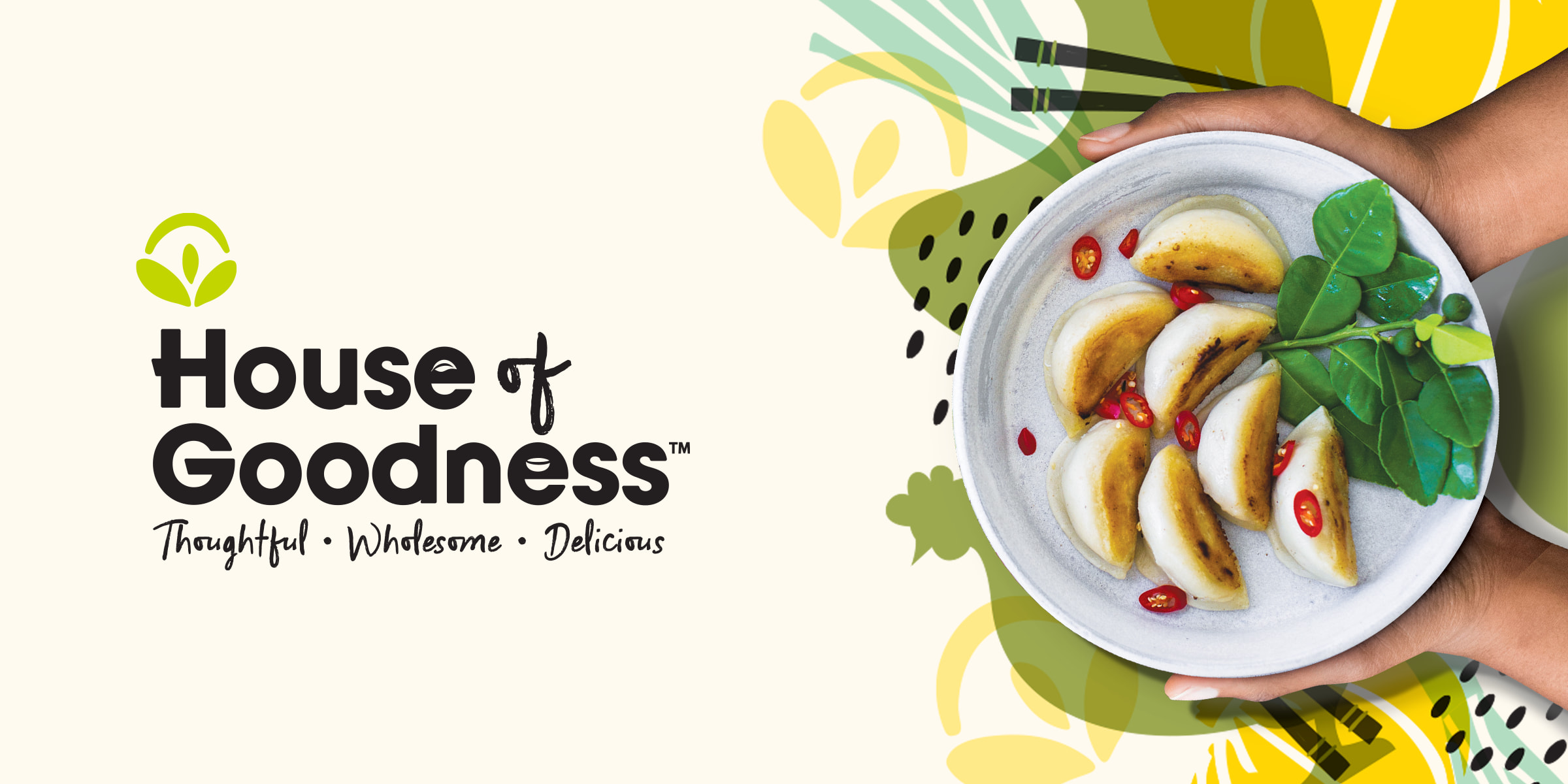
The logo is clean and simple, crafted from a bold sans serif font and combined with a hand-written script. The unique ‘House of Goodness’ symbol clearly nods towards Asia and is formed from three leaves and an organic shaped roof to give the brand a memorable and ownable additional asset.
A mixture of existing and new photography was used, but adapted to have an ownable style, with the addition of hands cupping the bowls to give a warm and approachable feel.
More info: Contact us
“It has been a pure joy working with Boxer & Co. The brilliant team understood our rebranding vision from the beginning and took great care in working with our timeframe to deliver an outstanding creative result. Thank you!”
Erika Chan,
Founder, House of Goodness

